JUNIPER AND JUNE
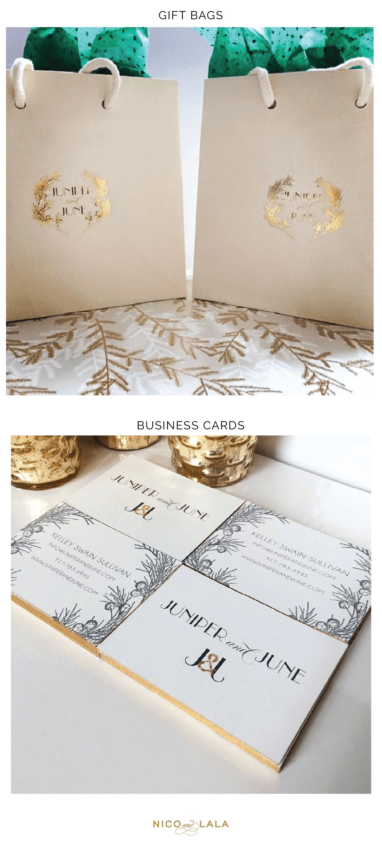
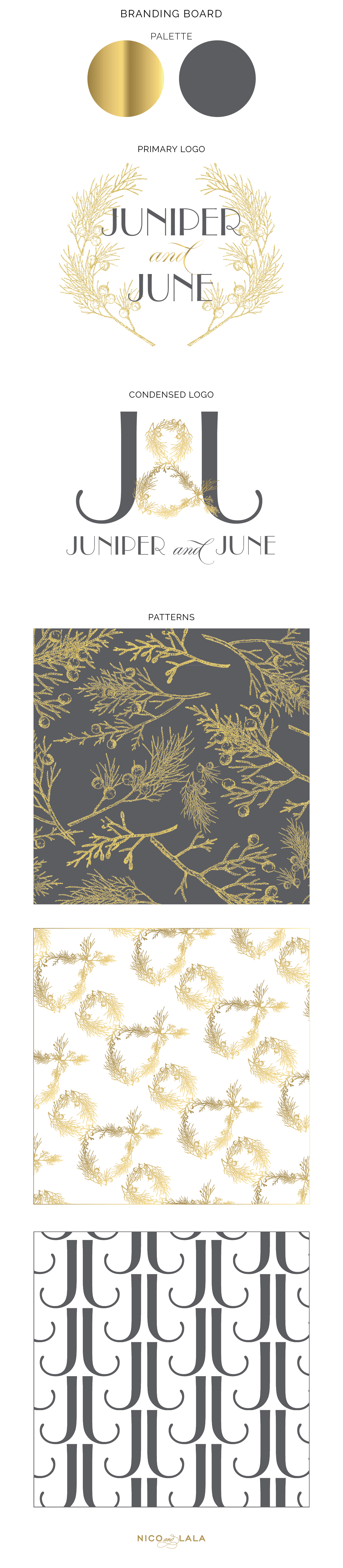
Juniper and June came to us after following us on social media for a few years and wanting help branding her start up jewelry business. It is so inspiring to see other people’s gifts and ideas and passions, and then helping them hone in on their brand and vision on paper! For Juniper and June (which, how great is that name?! Maybe we are partial to the two words with an “and” in between them. HA!) really wanted a gold and gray logo that was sophisticated, yet had a touch of vintage chic. Juniper sprigs were a must and we immediately thought of how gorgeous and sparkly they would be in gold foil. She also wanted two gold and gray logos to use for this high end jewelry line; one that was an overall main logo and then another that could easily be used on packaging and jewelry materials. The primary logo features a garland of juniper while the secondary mark is a J&J monogram with an ampersand created by juniper sprigs. We used a neutral, refined palette for Juniper and June. Since this is a jewelry line, a gold and gray logo seemed fitting for a business using metals and sparkles! Charcoal gray and white create such a dramatic and beautiful contrast with the gold foil. A gold and charcoal gray juniper print, a monogram pattern, and an ampersand pattern were created for this line! We also designed business cards printed in gold foil with gilded edges, and gold foil stamped shopping totes for Juniper and June! We love seeing visions come to life and are so proud to have worked with someone so talented! For more business branding with similar looks, make sure to check out Wanderlust Weddings and Events and design boutique The Pink Door!
If you would like our help branding your business, please fill out our online Branding Form!